The Color Guide
A Guide to Wise Owl Chalk Paint Colors
All 73 Wise Owl Chalk Synthesis paint colors. Below you'll find which colors pair well, how to paint with no sanding, which top coats to use, how much paint you need, and much more. An environmental scientist formulated it, and a Michigan family that's made paint since 1891 makes it. It sticks to most furniture with no sanding or priming, and it's Zero VOC, meaning none of the fumes most paints give off.
Please read first
An unofficial guide
Stellar Luxe is an independent retailer. We sell Wise Owl Chalk Synthesis Paint, and we made this guide because we love it. Wise Owl Paint did not write it, review it, or endorse it.
Every color in this guide belongs to Wise Owl. Wise Owl and Chalk Synthesis Paint are trademarks of Wise Owl Paint. The color chips are printed from Wise Owl's published chips. The numbers and descriptions next to them (LRV, lightness rank, warm or cool, and undertone) are our own estimates, not Wise Owl's specifications.
The pairs, trios, and advice in this guide are our opinions. For anything about a specific Wise Owl product, contact Wise Owl at wiseowlpaint.com.
All credit for the paint and its colors goes to Wise Owl.
Why Wise Owl
Why we sell Wise Owl
We carry Wise Owl Chalk Synthesis Paint because it's the best chalk paint we've used. Our customers keep coming back for it, and here's why.
- It's made from scratch in Michigan.
- Wise Owl makes the paint in Michigan, with a green certified team. Every ingredient goes into the mix at once. That's why the paint is smooth and even in the can.
- A scientist made it in her own kitchen.
- Karen Chouinard, the founder, is an environmental scientist. A store-bought chalk paint wiped off her kitchen table two days after she painted it, so she tested her own formulas in that kitchen. The one she trusted became Chalk Synthesis Paint.
- Clay based mineral paint, with nothing you don't want in it.
- It's made without unnecessary fillers or harsh solvents. The ethylene glycol and methanol found in some paints aren't in it. It's zero VOC (volatile organic compounds, the fumes most paints give off) and odor free within hours.
- It sticks with no sanding and no priming.
- It grips most furniture as it is. Wash the piece and start painting. The prep that stops most people from starting is gone. Cabinets, tile, and floors are the exception: they're always primed first.
- Rich pigment and real coverage.
- The color is deep and full. A pint covers about 80 square feet, a quart about 160, and a gallon about 640. One thin coat gives you the color. A second gives you fuller color.
- It holds up.
- The color is fade and UV resistant, so a piece in a sunny room stays the color you painted it. Brushes rinse clean with water. It dries fast.
- The whole line, from primer to topcoat.
- Wise Owl makes the Stain Eliminating Primer, the paint, and every finish that goes over it: Varnish, One Hour Enamel Clear, Furniture Wax, Furniture Salve, and Glaze. They're made to work together, so you never have to guess whether a topcoat will fight the paint.
- Pros and first-timers buy the same can.
- In our store and on our Etsy shop, the same paint goes home with professional furniture painters and with people painting their first dresser. Pros pick it for the finish and the coverage. First-timers pick it because there's no sanding, no priming, and no fumes. It works the same for both.
For any color you like in this guide, go to the color chart below. You can buy all of them there.
Colors shift on every screen and printer, so test a 2 oz sample on your piece before you buy a full size.
Every color in this guide is a Wise Owl color. We stock all 73 of them, in every size, and we're proud to sell them.
How to read the chart
How to read the chart
Under every color on the chart are a code, a lightness number, a place in line, and a note on which way it leans.
The colored squares on the chart are chips. Each chip is one color, as it prints on this page or shows on your screen.
In the corner of each chip is a six-character code, like #90B0AF. That's the color's hex code. A hex code is the code screens and printers use to name an exact color. Every color has one, and no two colors share one.
What it can't promise
The code doesn't promise the paint will match the chip. The code describes the chip on this page or on your screen. The paint is mixed pigment on wood. Light, sheen, and the surface all change how a color reads, so the dresser in your room will never be a perfect match for a printed square. A 2 oz sample on your piece is the only way to be sure.
What it's good for
Type the code into the search bar on your phone or computer, and the color comes up on that screen. Send the code to a friend, and she sees the same chip you're looking at. Hold that screen next to a photo of your fabric, your rug, or your wall to see whether the colors sit well together.
It's also handy for telling two close colors apart. Snow Owl is #F6F6F6 and Antique Villa is #F9F8F4. They look alike on the page, and the codes tell you they're two different whites.
The chip. This color as it prints on this page.
The hex code. The name screens and printers use for this exact color.
Higgins Lake · LRV 40 · lightness 18 of 73 · Cool, slight blue-green undertone
LRV is short for light reflectance value. It's a score for how much light a color bounces back into the room. 0 is black, which bounces back none of it. 100 is white, which bounces back all of it. Every color on the chart has its LRV printed under its name.
Why it matters
LRV tells you how a color will behave in your room before you open a can. A high LRV brightens a dim corner and makes a small room feel bigger. A low LRV makes a piece feel solid, settled, and distinguished, and it hides blemishes. A mid LRV does a little of both, and it's the easiest kind of color to live with.
How to pick one
Decide what you want the piece to do. Then look at the number.
One more use. Two colors at least 15 LRV points apart look like two different colors from across the room. Two colors closer than that blur into one. That rule is behind every pair and trio in this guide.
Light, LRV 60 and up
Brightens the room. Best on pieces that don't get handled all day.
Mid, LRV 20 to 59
Shows the color clearly and hides everyday wear. The safest place to start.
Dark, under LRV 20
Solid, settled, and distinguished. Hides fingerprints and blemishes. Reads as one deep color from across the room.
1 is the lightest, Antique Villa. 73 is the darkest, Jet Black. On the chart it's printed as "lightness 18 of 73". The rank and the LRV say the same thing two ways. LRV tells you how light a color is. The rank tells you where it stands among the other 72.
It also helps when a color is close but not quite right. Look one or two places up or down the line. Limestone, a pale gray, is 9. Iconic Gray, at 13, is the same kind of gray a shade deeper.
Why it helps
The rank is the fastest way to see how far apart two colors are. Two colors far apart in the line will always look different on one piece. Two neighbors will blur into each other from across the room. Higgins Lake is 18 and Vintage Duck Egg is 19. Side by side on one dresser, you'd have to walk up close to tell them apart. Higgins Lake at 18 and Anchor at 60 are 42 places apart, and you'd see two clear colors from the doorway.
1
Antique Villa
2
Snow Owl
3
Blush
4
Isles Ave
5
White Birch
6
Kashmir
7
Bone
8
Daydream
9
Limestone
10
Soleil
11
Natural Light
12
Sea Salt
13
Iconic Gray
14
Linen
15
Renovation Gray
16
Urban Rhino
17
1987
18
Higgins Lake
19
Vintage Duck Egg
20
Pink Suede
21
Gray Linen
22
Fauna
23
Dijon
24
Celtic Fog
25
Smokey Quartz
26
Safari Jacket
27
Chartreuse
28
Wuthering Heights
29
Terracotta
30
Overland Green
31
Deep Turquoise
32
Grecian Clay
33
Earthen Ash
34
Dried Thyme
35
River Rock
36
Metrocity
37
Shade Green
38
Tango
39
Leatherwood
40
Peppercorn
41
Spanish Olive
42
Rocksteady
43
Vintage Denim
44
Military Bronze
45
Perfect Red
46
Weathervane
47
Prussian Blue
48
Abyss
49
Foxtrot
50
Verde Azul
51
Charleston Green
52
Botanical
53
Siren Song
54
Bowie
55
Chocolate
56
Rosewood
57
Republic Red
58
Black Cherry
59
Graphic Slate
60
Anchor
61
Carbon
62
Earth
63
Atomic Blue
64
Dark Forest
65
Wrought Iron
66
Poseidon
67
Inkwell
68
Weathered Bronze
69
Jupiter
70
Raven
71
Plum Velvet
72
Dark Mahogany
73
Jet Black
Warm
Warm colors lean toward red, orange, yellow, or cream.
Cool
Cool colors lean toward green, blue, or violet.
Neutral
Neutral colors don't lean either way.
The undertone is the faint tint inside a color. It's the reason one white looks creamy and another looks icy when they sit side by side. The chart names it for you. Isles Ave reads "Warm, slight yellow undertone". Celtic Fog reads "Cool, slight green undertone". Two colors with the same undertone look like they belong together. Two with opposite undertones make each other look brighter.
Warm
LRV 78 · Warm, slight yellow undertone
LRV 61 · Warm, yellow
LRV 26 · Warm, coral
LRV 13 · Warm, slight brown undertone
LRV 5 · Warm, red
Cool
LRV 59 · Cool, slight green undertone
LRV 40 · Cool, slight blue-green undertone
LRV 36 · Cool, slight green undertone
LRV 10 · Cool, slight blue undertone
LRV 4 · Cool, slight blue undertone
How a pro thinks it through
Say you want a warm, cozy dining room. Here's how a pro would work down the chart.
The feeling first.
Cozy means darker and warm. So she looks for a low LRV, a rank well down the line, and a warm lean.
The candidates.
Rosewood is LRV 5, rank 56, warm, red. Chocolate is LRV 6, rank 55, warm with a slight brown undertone. Leatherwood is LRV 13, rank 39, warm with a slight brown undertone. Any of the three would make a set of chairs feel settled. She picks Rosewood.
What goes next to it.
Dark chairs need something lighter beside them, at least 15 LRV points away. She wants the room to stay warm, so she looks for a light color that also leans warm: a cream or a beige. Kashmir is LRV 78, warm with a slight yellow undertone. Linen is LRV 55, warm, yellow. She takes both: Kashmir for the hutch and Linen for the table base. Kashmir to Rosewood is a gap of 73. Linen to Rosewood is 50. Kashmir to Linen is 23. Every gap is over 15, so all three read as their own color.
The undertone check.
Rosewood's undertone is red. Kashmir's is a slight yellow. Linen's is yellow. All three lean warm, so the cream won't turn the red cold and the red won't make the cream look dirty. She's done. A Kashmir hutch, Rosewood chairs, a Linen table. That set is the Dinner party trio.
That's the whole method. The feeling, then the LRV and the rank, then the lean, then the undertone. Think this way and you're thinking like a pro, without the years of school.
Hutch
Kashmir, LRV 78Chairs
Rosewood, LRV 5Table
Linen, LRV 55
The Color Chart
Every color, sorted by family
Each chip below matches Wise Owl's official color chip for that shade. Tap any color for a closer look, its pairings, and where to buy it. You can also compare shades side by side.
Colors may vary with your screen settings. Try a 2 oz sample on your piece before you commit.
73 of 73 colors
Whites and Creams
Beiges and Warm Neutrals
Grays and Blacks
Green Grays and Sages
Blues
Teals and Deep Greens
Yellows, Oranges and Browns
Reds, Pinks and Plums
Which white
Which white, from warmest to coolest
Every color with an estimated LRV above 75, from warm to neutral. Ordered by how warm the undertone is, not by LRV. None of these whites leans cool. If you want a white with a cool, gray edge, the next step down is Limestone (LRV 71), a neutral.
LRV 85
LRV 84
LRV 78
LRV 83
LRV 94
LRV 76
LRV 92
| Color | LRV |
|---|---|
| BlushWarm · slight peach undertone | 85 |
| Isles AveWarm · slight yellow undertone | 84 |
| KashmirWarm · slight yellow undertone | 78 |
| White BirchWarm · slight yellow-green undertone | 83 |
| Antique VillaNeutral · no undertone | 94 |
| BoneNeutral · no undertone | 76 |
| Snow OwlNeutral · no undertone | 92 |
How to choose
Think about where the piece will live. Near warm wood floors and cream walls, a warm white (Blush, Isles Ave, Kashmir, White Birch) blends in, and a neutral white (Snow Owl) can look blue. Near gray floors and bright white trim, a neutral white matches, and a warm white can look yellow.
Antique Villa sits between the two groups. Its chroma (how strong its color is) is 2.1, just under the neutral cut, with a faint yellow lean. That's why it's the most popular neutral for cabinets.
Whites need more paint, and on some woods a primer
Whites, red, and black need the most coats because of their pigments, so plan on more paint when you paint white. Read the 3 coat column.
Use White primer under whites and light colors on woods that bleed (mahogany, knotty pine, cherry) and on any white piece from the Depression era.
For a topcoat on white, use Varnish or clear Furniture Wax. Neither one yellows. Furniture Salve is made with hemp oil, which can tint whites, so skip it on a white piece.
Pairings Wise Owl recommends
Color pairings that work
Wise Owl named these pairings in its color guides. Every color here is available in our store.
Anchor + Snow Owl
A true navy that belongs next to Snow Owl.
Anchor + Republic Red
Americana harmony, navy with cranberry red.
Higgins Lake + Peppercorn
The favorite blue with a rich graphite gray.
Higgins Lake + Grecian Clay
Lake blue with a richer shade of greige.
Smokey Quartz + Peppercorn
True gray accented with graphite, a two toned beauty.
Gray Linen + Grecian Clay
Greige and its richer counterpart, the maker's favorite pairing.
Limestone + Vintage Duck Egg
The maker's personal favorite next to this whisper of gray.
Sea Salt + Snow Owl
Beachy sea salt air beside a clean crisp white.
Antique Villa + Bowie
The best selling off white with a show stopping peacock blue.
River Rock + Limestone
Stone blue gray in natural harmony with Limestone.
Deep Turquoise + Peppercorn
Rich turquoise grounded by a deep cool gray.
Weathervane + Vintage Duck Egg
Rich bronze beside a soft green gray from nature.
Colors that go with everything
The safest colors on the chart
Each of these goes with every other color in the line. Most of them are neutrals, or close to it. Higgins Lake is the one blue that goes with every neutral.
Antique Villa
Complements all colors, the cabinet favorite
Gray Linen
The most versatile of all shades
Smokey Quartz
Coordinates with any shade
Higgins Lake
Plays nicely with all colors
Vintage Duck Egg
Almost a neutral, pairs with them all
What we mean by each word
A pair is two colors on one piece, or on two pieces that sit together. One is the main color and covers most of the surface. The other is the second color: the drawer fronts, the inside, the top, or the trim.
A trio is three colors. We call the roles main, second, and third. The third isn't always a small accent. Sometimes it's a whole piece across the room.
A palette is any set of colors you've decided belong together, two, three, or more. Every pair and trio in this guide is a small palette.
Pairs we recommend
Pairs that work, and why
Every pair below passes one test. The two colors are at least 15 LRV points apart, so they read as two colors from across the room. Under each pair you'll find the gap in numbers, whether the two lean the same way, and where each color goes on the piece.
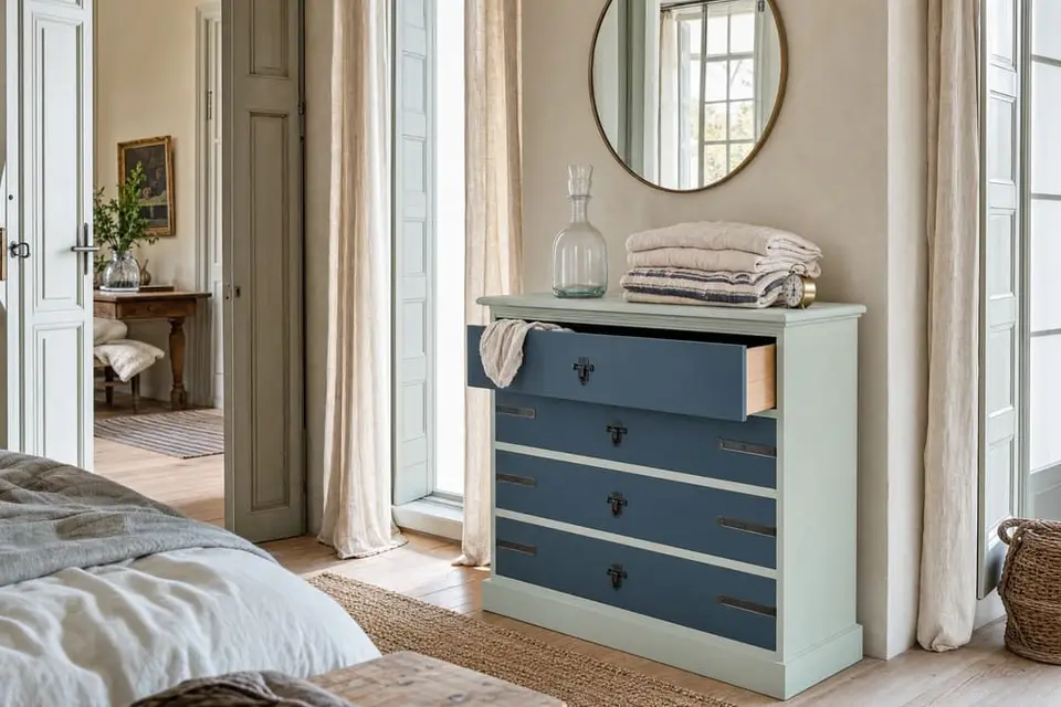
Tide line
Main: Sea Salt · Second: Vintage Denim
Sea Salt is LRV 59 and Vintage Denim is LRV 10, a gap of 49 points, so the two look clearly different from across the room. Both lean cool, so they look like they belong together. Paint the body of the piece in Sea Salt and the drawer fronts in Vintage Denim.
A dresser in a bedroom or a guest room.
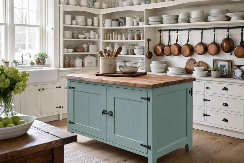
Harbor light
Main: Higgins Lake · Second: Antique Villa
Higgins Lake is LRV 40 and Antique Villa is LRV 94, a gap of 54 points. Higgins Lake leans cool and Antique Villa is a neutral with no undertone, so the white doesn't pull the blue warmer or colder. Paint the island or the body in Higgins Lake and the cabinets around it, or the trim, in Antique Villa.
A kitchen island with the cabinets around it, or a hutch in a dining room.
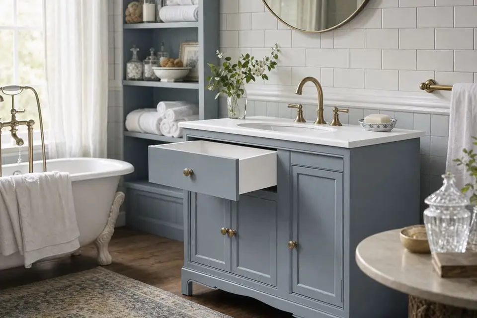
Morning fog
Main: Wuthering Heights · Second: Snow Owl
Wuthering Heights is LRV 30 and Snow Owl is LRV 92, a gap of 62 points. Wuthering Heights leans cool with a slight blue undertone, and Snow Owl is a neutral white, so the gray keeps its soft blue look. Paint the vanity or the nightstand in Wuthering Heights and the top, the trim, or the inside of the drawers in Snow Owl.
A bathroom vanity, or a pair of nightstands in a bedroom.
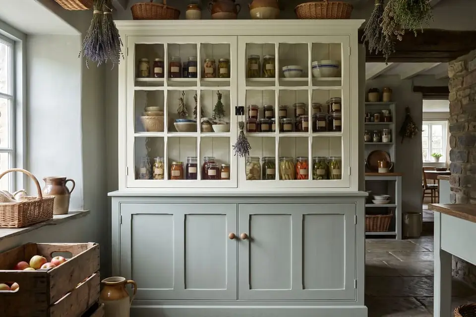
Sage and cream
Main: Renovation Gray · Second: White Birch
Renovation Gray is LRV 47 and White Birch is LRV 83, a gap of 36 points. Renovation Gray leans cool and White Birch leans warm, but both have a slight green undertone, so the white looks like it belongs with the sage. Paint the lower cabinets in Renovation Gray and the upper cabinets in White Birch.
Kitchen cabinets, or a pantry hutch.
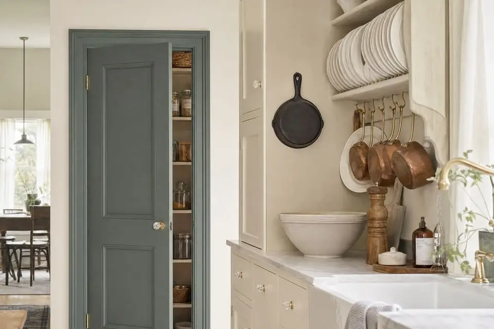
Herb window
Main: Dried Thyme · Second: Kashmir
Dried Thyme is LRV 18 and Kashmir is LRV 78, a gap of 60 points. Dried Thyme leans cool and Kashmir leans warm, so each one makes the other look brighter: the green looks greener and the cream looks creamier. Paint the island or the door in Dried Thyme and the cabinets around it in Kashmir.
A kitchen island, or a pantry door in a kitchen.
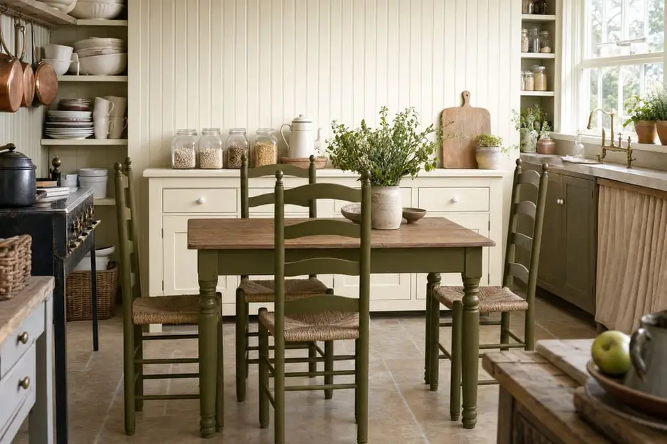
Olive and linen
Main: Spanish Olive · Second: Isles Ave
Spanish Olive is LRV 11 and Isles Ave is LRV 84, a gap of 73 points. Both lean warm with a yellow undertone, so they look like they belong together. Paint the chairs and the table base in Spanish Olive and the sideboard in Isles Ave.
A table and chairs with a sideboard, in a kitchen or a dining room.
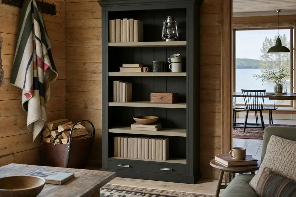
Fir and moss
Main: Dark Forest · Second: Safari Jacket
Dark Forest is LRV 3 and Safari Jacket is LRV 33, a gap of 30 points. Both lean warm with a yellow undertone, so the dark green and the khaki look like they belong together. Paint the back panel in Dark Forest and the shelves in Safari Jacket.
A bookcase in a den, or a bench in a mudroom.
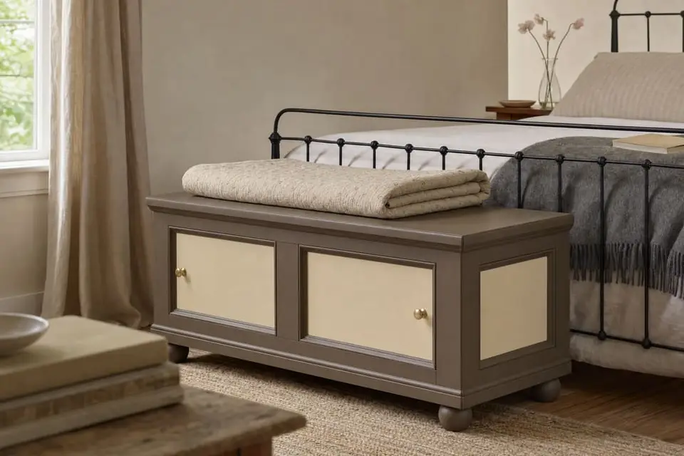
Saddle and oat
Main: Leatherwood · Second: Natural Light
Leatherwood is LRV 13 and Natural Light is LRV 61, a gap of 48 points. Both lean warm, one brown and one yellow, so they look like they belong together. Paint the body in Leatherwood and the drawer fronts or the panels in Natural Light.
A blanket chest or a headboard in a bedroom.
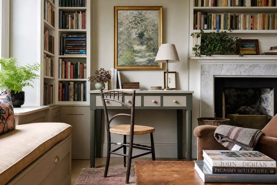
Pine and stone
Main: Foxtrot · Second: Gray Linen
Foxtrot is LRV 7 and Gray Linen is LRV 37, a gap of 30 points. Foxtrot leans cool and Gray Linen leans warm, so the warm gray softens the dark green. Paint the body in Foxtrot and the top or the drawer fronts in Gray Linen.
A writing desk in a home office, or a cabinet in an entryway.
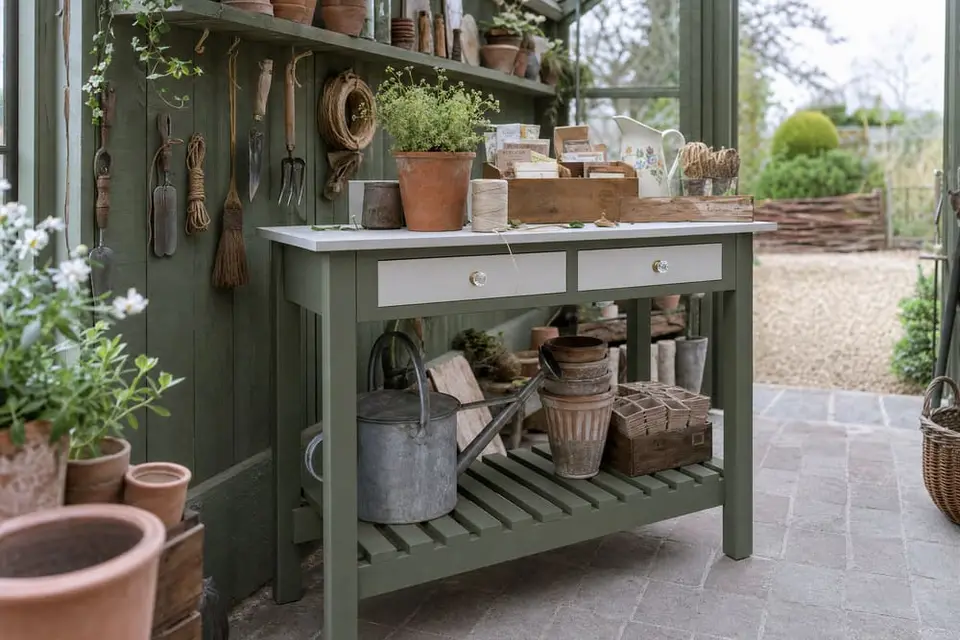
Potting bench
Main: Shade Green · Second: Limestone
Shade Green is LRV 15 and Limestone is LRV 71, a gap of 56 points. Shade Green leans cool and Limestone is a neutral with no undertone, so the pale gray doesn't change how the green looks. Paint the bench or the cabinet in Shade Green and the top, the door frames, or the drawer fronts in Limestone.
A potting bench or a tool cabinet in a garden shed, or a set of shutters.
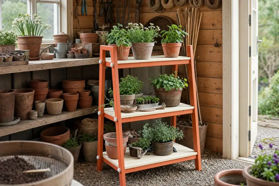
Clay pot
Main: Terracotta · Second: Isles Ave
Terracotta is LRV 26 and Isles Ave is LRV 84, a gap of 58 points. Both lean warm, so the cream looks like it belongs with the orange and calms it down. Paint the plant stand or the door in Terracotta and the slats or the panels in Isles Ave.
A plant stand, a shed door, or a small bench on a porch or in a garden.
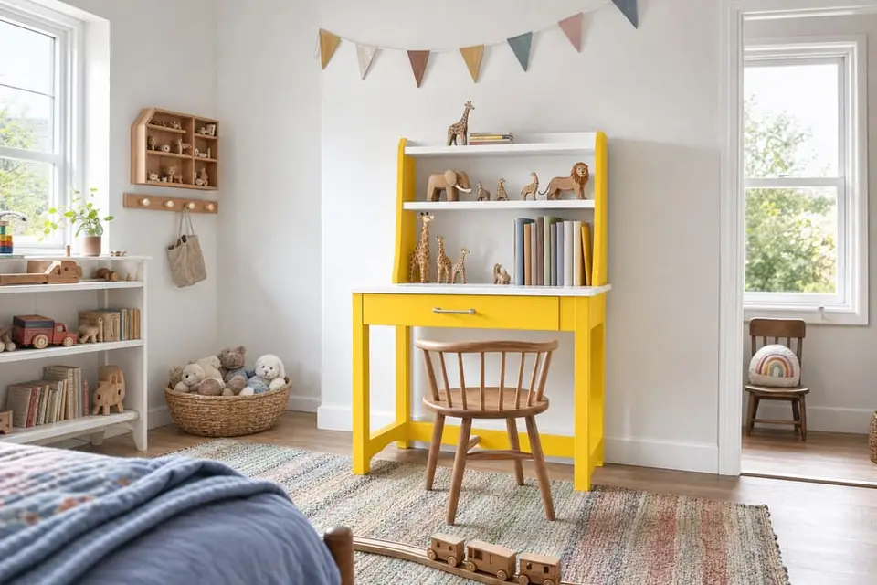
Lemonade
Main: Soleil · Second: Snow Owl
Soleil is LRV 65 and Snow Owl is LRV 92, a gap of 27 points. Soleil leans warm with a strong yellow, and Snow Owl is a neutral white, so the white keeps the yellow from taking over the room. Paint the body in Soleil and the shelves, the top, or the trim in Snow Owl.
A toy chest, a small bookcase, or a desk in a child's bedroom.
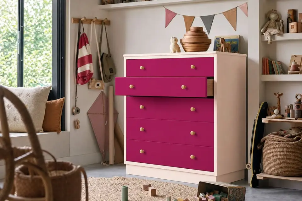
Strawberry cream
Main: Blush · Second: Rocksteady
Blush is LRV 85 and Rocksteady is LRV 11, a gap of 74 points. Both lean warm, so the pale pink and the deep raspberry look like they belong together. Paint the body in Blush and the drawer fronts in Rocksteady.
A dresser or a bookcase in a child's bedroom.
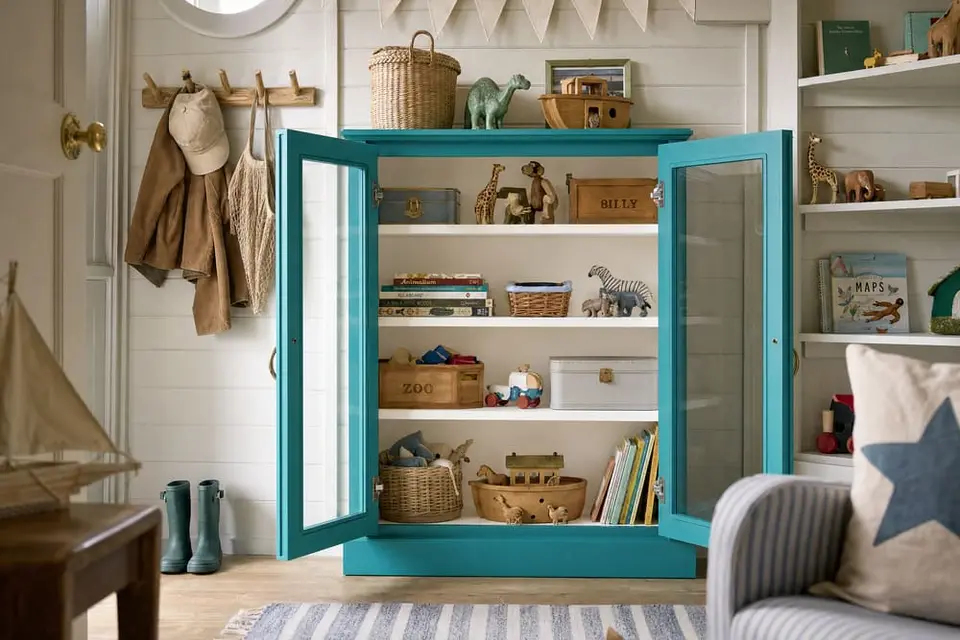
Pool day
Main: Deep Turquoise · Second: Antique Villa
Deep Turquoise is LRV 22 and Antique Villa is LRV 94, a gap of 72 points. Deep Turquoise leans cool and Antique Villa is a neutral white, so the turquoise stays bright without looking cold. Paint the body in Deep Turquoise and the top, the shelves, or the inside of the drawers in Antique Villa.
A desk or a toy cupboard in a child's bedroom or a playroom.
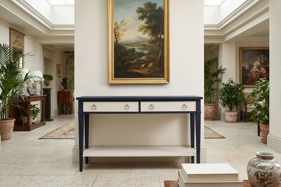
Midnight and cream
Main: Inkwell · Second: Kashmir
Inkwell is LRV 2 and Kashmir is LRV 78, a gap of 76 points. Inkwell leans cool and Kashmir leans warm, so the cream looks warmer next to the navy and the navy looks deeper. Paint the frame in Inkwell and the drawer fronts, the shelf, or the inside in Kashmir.
A console table or a bar cabinet in a living room, or a headboard in a bedroom.
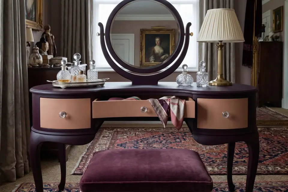
Velvet and rose
Main: Plum Velvet · Second: Pink Suede
Plum Velvet is LRV 1 and Pink Suede is LRV 38, a gap of 37 points. Plum Velvet leans cool and Pink Suede leans warm, so the tan looks rosier next to the plum. Paint the body in Plum Velvet and the drawer fronts or the inside in Pink Suede.
A vanity or a jewelry cabinet in a bedroom or a dressing room.
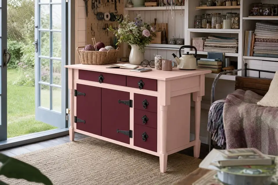
Peony
Main: Daydream · Second: Rosewood
Daydream is LRV 71 and Rosewood is LRV 5, a gap of 66 points, so the two read as two colors from the doorway. Both lean warm, one peach and one red, so the deep red looks like a darker shade of the pink instead of a stranger. Paint the body of the desk or the cabinet in Daydream and the drawer fronts or the door in Rosewood.
A desk or a small cabinet in a she shed or a craft room.
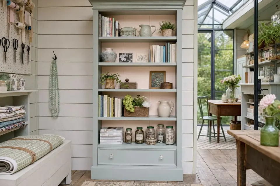
Sage and blush
Main: Vintage Duck Egg · Second: Blush
Vintage Duck Egg is LRV 39 and Blush is LRV 85, a gap of 46 points. Vintage Duck Egg leans cool with a slight green undertone and Blush leans warm with a slight peach undertone, so each one makes the other look brighter: the green looks fresher and the pink looks softer. Paint the bookcase in Vintage Duck Egg and the back panel in Blush.
A bookcase or a hutch in a she shed.
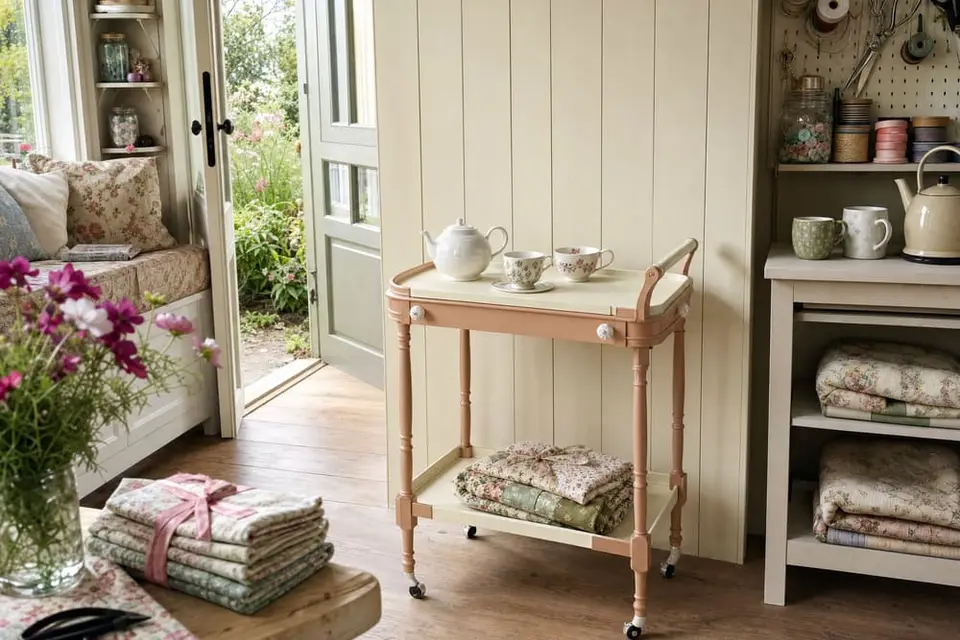
Rose garden
Main: Pink Suede · Second: White Birch
Pink Suede is LRV 38 and White Birch is LRV 83, a gap of 45 points. Both lean warm, so the rosy tan and the soft white look like they belong together. Paint the tea cart or the side table in Pink Suede and the top and the trim in White Birch.
A tea cart or a side table in a she shed or a sunroom.
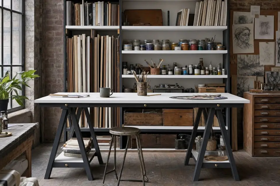
Gallery white
Main: Snow Owl · Second: Carbon
Snow Owl is LRV 92 and Carbon is LRV 4, a gap of 88 points, the biggest contrast on the chart short of Jet Black. Both are neutrals with no undertone, so the white stays clean and the dark gray stays a true dark gray, with nothing tinting either one. Paint the shelving or the work table in Snow Owl and the legs, the frame, or the top in Carbon.
Shelving or a work table in an art studio or a loft.
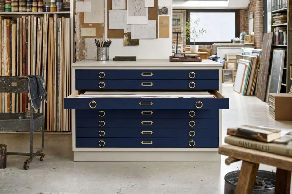
Blueprint
Main: Iconic Gray · Second: Atomic Blue
Iconic Gray is LRV 59 and Atomic Blue is LRV 3, a gap of 56 points. Iconic Gray is a neutral with no undertone and Atomic Blue leans cool with a strong blue, so the gray doesn't shift the blue at all and the blue is the only color you see. Paint the cabinet in Iconic Gray and the drawer fronts in Atomic Blue.
A flat file or a supply cabinet in a studio or a home office.
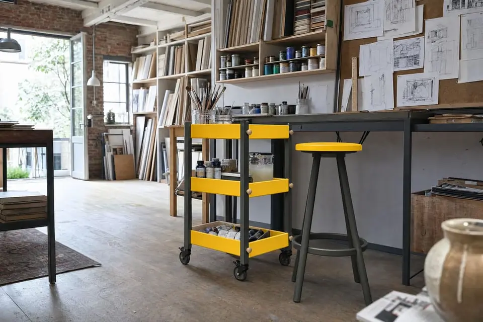
Yellow and slate
Main: Soleil · Second: Graphic Slate
Soleil is LRV 65 and Graphic Slate is LRV 5, a gap of 60 points. Soleil leans warm with a strong yellow and Graphic Slate is a neutral with no undertone, so the dark gray doesn't dull the yellow and the yellow looks even brighter beside it. Paint the cart or the stool in Soleil and the legs and the frame in Graphic Slate.
A rolling cart or a stool in an art studio or a loft.
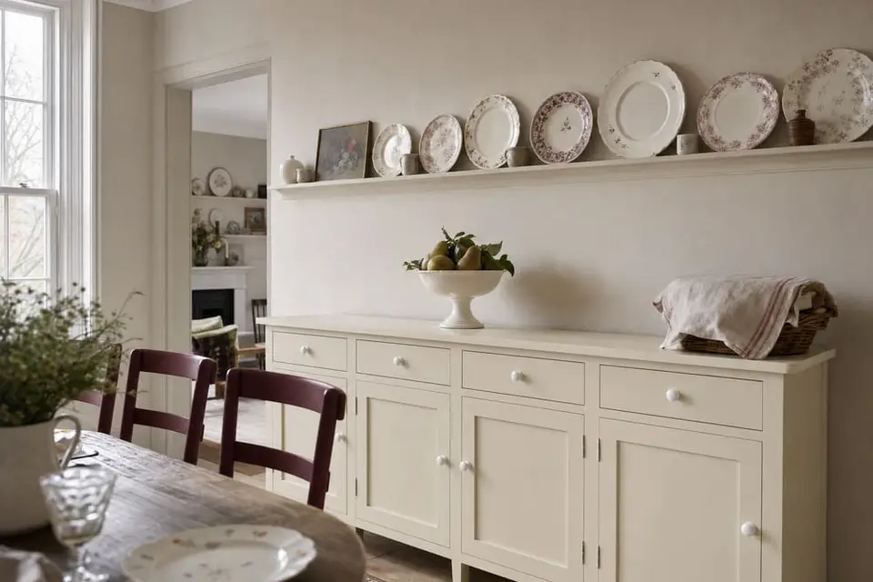
Candlelight
Main: Kashmir · Second: Rosewood
Kashmir is LRV 78 and Rosewood is LRV 5, a gap of 73 points. Both lean warm, one yellow and one red, so the cream doesn't turn the red cold and the red doesn't make the cream look dirty. Paint the hutch or the sideboard in Kashmir and the chairs in Rosewood.
A sideboard with a set of chairs in a dining room.
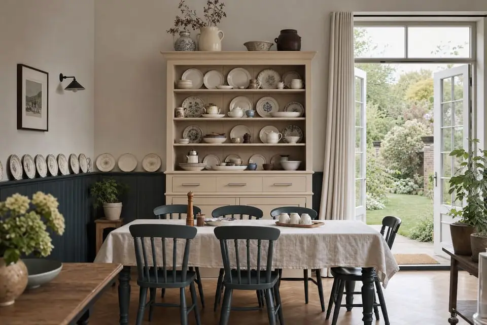
Evergreen and linen
Main: Charleston Green · Second: Linen
Charleston Green is LRV 6 and Linen is LRV 55, a gap of 49 points. Charleston Green leans cool with a slight blue-green undertone and Linen leans warm with a yellow undertone, so each one makes the other look richer: the green looks deeper and the beige looks warmer. Paint the table base and the chairs in Charleston Green and the hutch in Linen.
A table and chairs with a hutch in a dining room.
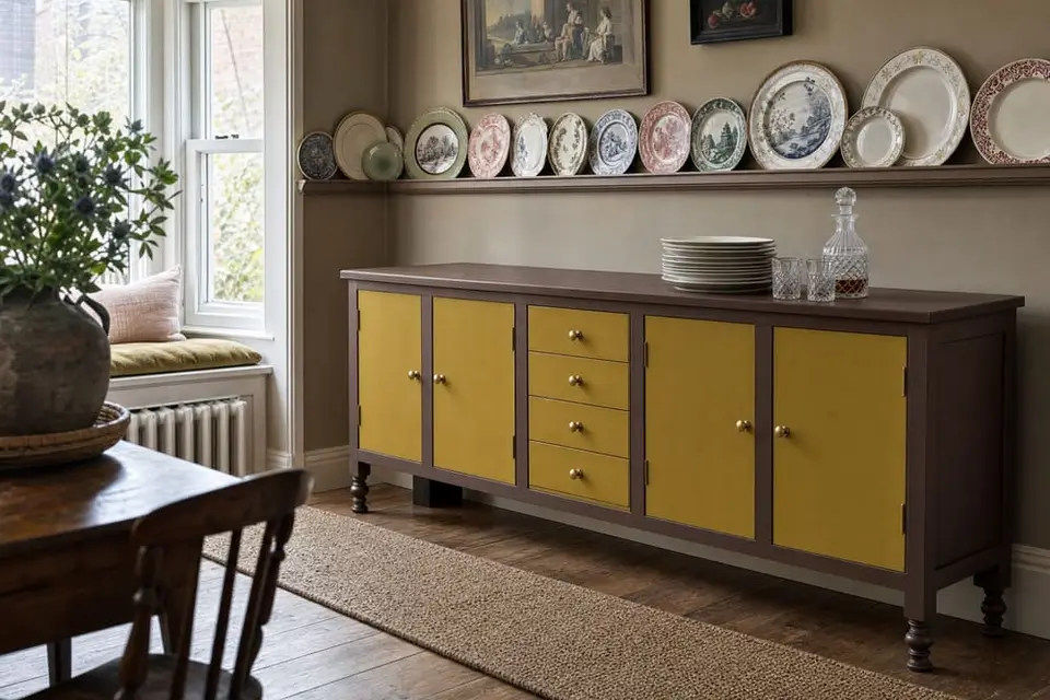
Dijon and chocolate
Main: Chocolate · Second: Dijon
Chocolate is LRV 6 and Dijon is LRV 36, a gap of 30 points. Both lean warm, one brown and one yellow, so the mustard looks like it grew out of the brown. Paint the body of the buffet in Chocolate and the drawer fronts or the doors in Dijon.
A buffet or a sideboard in a dining room.
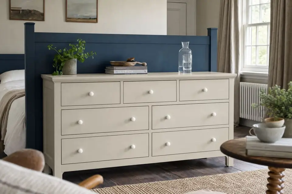
Denim and stone
Main: Iconic Gray · Second: Vintage Denim
Iconic Gray is LRV 59 and Vintage Denim is LRV 10, a gap of 49 points. Iconic Gray is a neutral with no undertone and Vintage Denim leans cool with a slight blue undertone, so the gray lets the blue stay a soft, faded blue. Paint the dresser in Iconic Gray and the headboard in Vintage Denim.
A dresser and a headboard in a master bedroom.
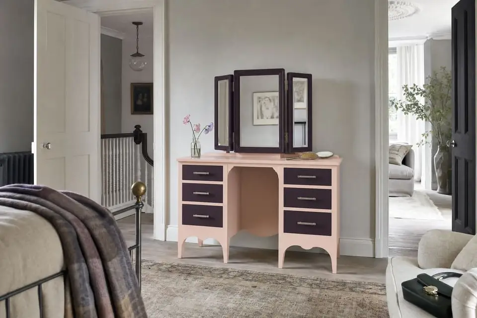
Rose and plum
Main: Daydream · Second: Black Cherry
Daydream is LRV 71 and Black Cherry is LRV 5, a gap of 66 points. Daydream leans warm with a slight peach undertone and Black Cherry leans cool with a slight plum undertone, so each one makes the other look richer: the peach looks warmer and the plum looks deeper. Paint the body of the dresser in Daydream and the drawer fronts in Black Cherry.
A dresser or a vanity in a master bedroom.
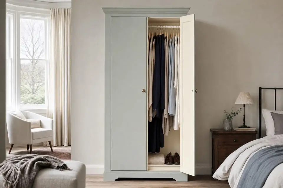
Fog and cream
Main: Celtic Fog · Second: Kashmir
Celtic Fog is LRV 36 and Kashmir is LRV 78, a gap of 42 points. Celtic Fog leans cool with a slight green undertone and Kashmir leans warm with a slight yellow undertone, so the cream looks creamier and the gray green looks fresher. Paint the wardrobe in Celtic Fog and the trim and the inside in Kashmir.
A wardrobe or an armoire in a master bedroom.
Trios we recommend
Where each color goes
Each trio gives every color a job. The main color covers the most, the second comes next, and the third covers the least or is one piece across the room. Every color is at least 15 LRV points from the other two.
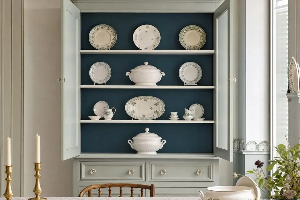
Low tide
Main: Sea Salt · Second: Prussian Blue · Third: Bone
Sea Salt is LRV 59, Prussian Blue is LRV 8, and Bone is LRV 76, so every gap is at least 17 points. Sea Salt and Prussian Blue both lean cool, and Bone is a neutral, so the three look like they belong together. Paint the body in Sea Salt, the back panel in Prussian Blue, and the trim and shelf edges in Bone.
A hutch in a dining room.
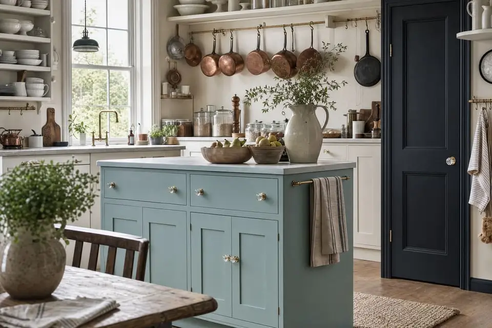
Harbor morning
Main: Higgins Lake · Second: Antique Villa · Third: Raven
Higgins Lake is LRV 40, Antique Villa is LRV 94, and Raven is LRV 1, so every gap is at least 39 points. Higgins Lake and Raven both lean cool, and Antique Villa is a neutral, so the three look like they belong together. Paint the island in Higgins Lake, the cabinets in Antique Villa, and the pantry door or one hutch in Raven.
A kitchen with an island, cabinets, and a pantry door.
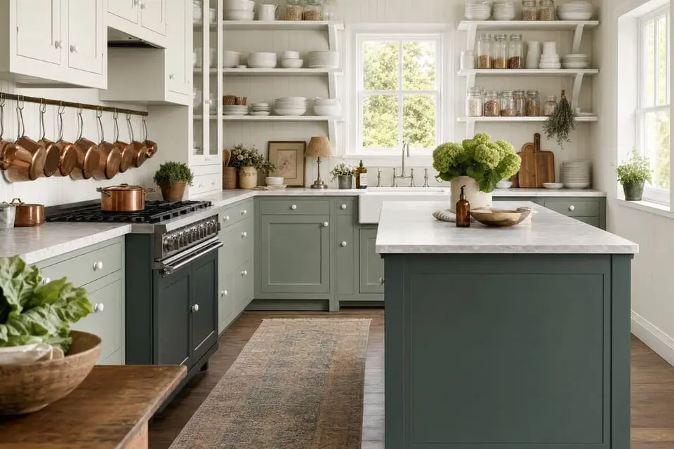
Herb garden
Main: Antique Villa · Second: Renovation Gray · Third: Dried Thyme
Antique Villa is LRV 94, Renovation Gray is LRV 47, and Dried Thyme is LRV 18, so every gap is at least 29 points. Renovation Gray and Dried Thyme both lean cool with a green undertone, and Antique Villa is a neutral, so the three look like one family. Paint the upper cabinets in Antique Villa, the lower cabinets in Renovation Gray, and the island in Dried Thyme.
Kitchen cabinets with an island.
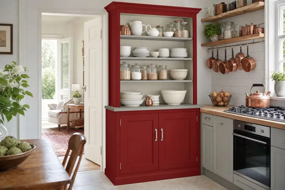
Cranberry barn
Main: Republic Red · Second: Bone · Third: Smokey Quartz
Republic Red is LRV 5, Bone is LRV 76, and Smokey Quartz is LRV 34, so every gap is at least 29 points. Republic Red leans warm, and Bone and Smokey Quartz are both neutrals, so the two grays let the red be the only strong color. Paint the body in Republic Red, the inside in Bone, and the top and shelves in Smokey Quartz.
A hutch in a farmhouse kitchen, or a bench in an entryway.
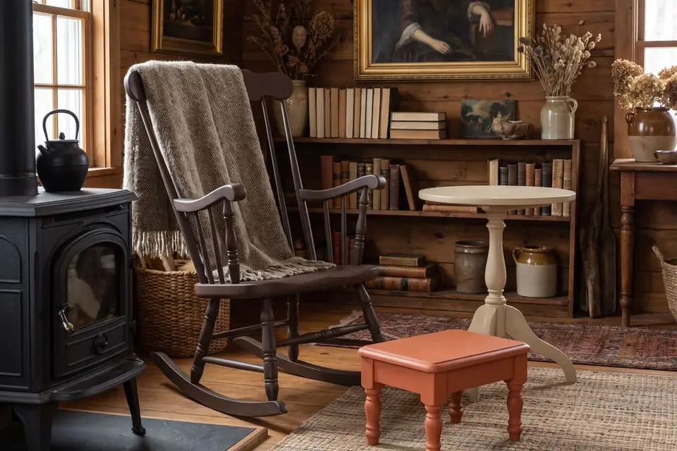
Woodstove
Main: Chocolate · Second: Natural Light · Third: Terracotta
Chocolate is LRV 6, Natural Light is LRV 61, and Terracotta is LRV 26, so every gap is at least 20 points. All three lean warm, so they look like they belong in one room. Paint a rocking chair or a blanket chest in Chocolate, a side table in Natural Light, and a stool in Terracotta.
Three pieces in a living room or a cabin den.
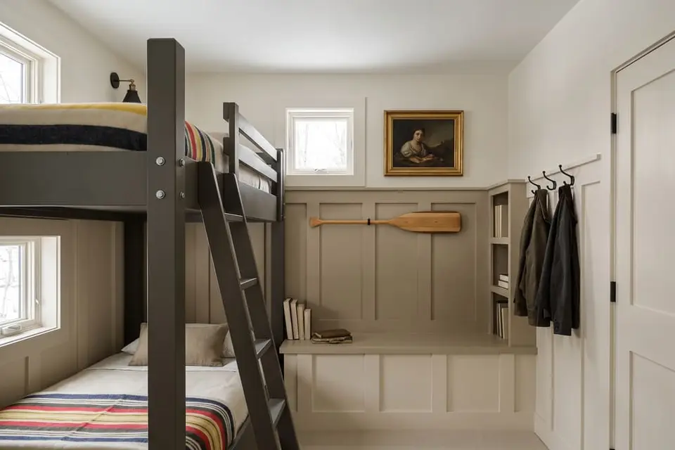
Bunk room
Main: Military Bronze · Second: Fauna · Third: Isles Ave
Military Bronze is LRV 9, Fauna is LRV 37, and Isles Ave is LRV 84, so every gap is at least 28 points. All three lean warm with a brown or yellow undertone, so they look like they belong together. Paint the bed frame in Military Bronze, the wainscot or a dresser in Fauna, and the trim and the bench in Isles Ave.
A bed frame, the wainscot, and a bench in a bunk room or a child's bedroom.
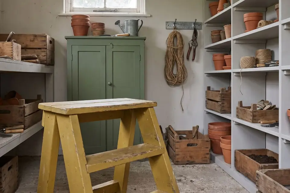
Potting shed
Main: Shade Green · Second: Limestone · Third: Dijon
Shade Green is LRV 15, Limestone is LRV 71, and Dijon is LRV 36, so every gap is at least 21 points. Shade Green leans cool and Dijon leans warm, and Limestone is a neutral that sits between them so the two don't fight. Paint the tool cabinet in Shade Green, the potting bench and the shelves in Limestone, and a step stool in Dijon.
A potting bench, a tool cabinet, and a stool in a garden shed.
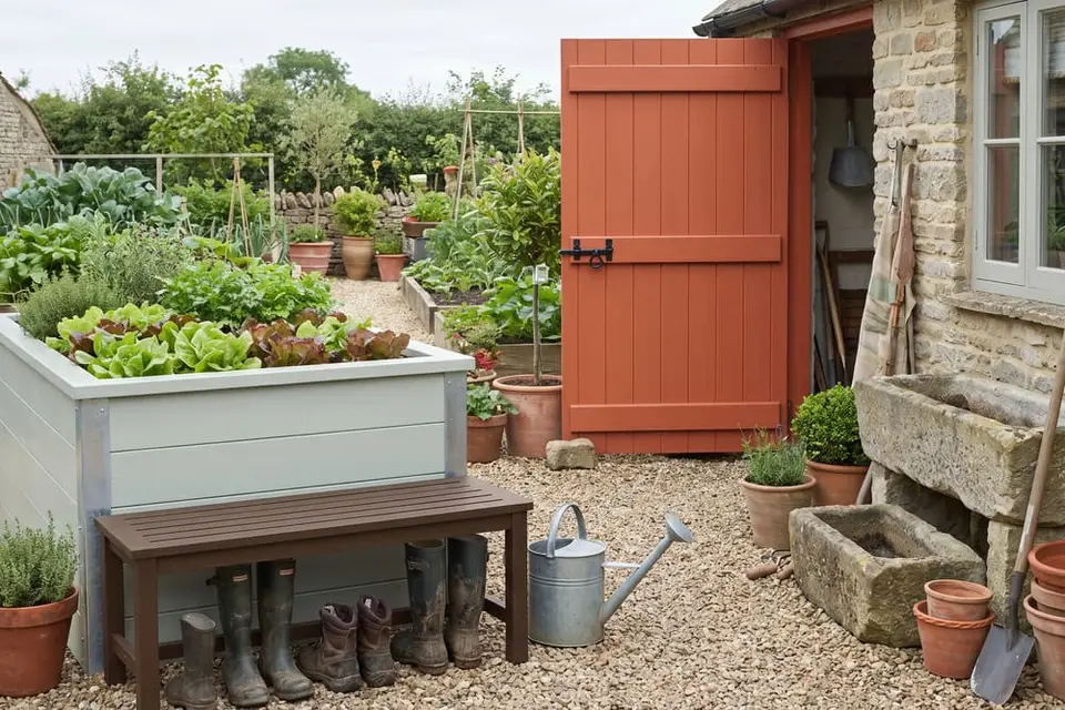
Clay and sage
Main: Terracotta · Second: Sea Salt · Third: Earth
Terracotta is LRV 26, Sea Salt is LRV 59, and Earth is LRV 4, so every gap is at least 22 points. Terracotta and Earth both lean warm, and Sea Salt leans cool, so the gray green cools the set down and the brown settles it. Paint the shed door in Terracotta, the planter box or the bench in Sea Salt, and the boot bench in Earth.
A shed door, a bench, and a boot bench on a porch or in a garden. Outdoor pieces get three thin coats of Varnish.
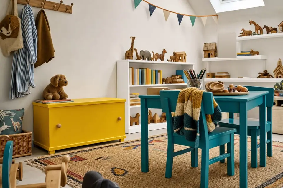
Lemonade stand
Main: Soleil · Second: Snow Owl · Third: Deep Turquoise
Soleil is LRV 65, Snow Owl is LRV 92, and Deep Turquoise is LRV 22, so every gap is at least 27 points. Soleil leans warm and Deep Turquoise leans cool, and Snow Owl is a neutral white that sits between them so the two bright colors don't fight. Paint the toy chest in Soleil, the bookcase in Snow Owl, and a small table and chairs in Deep Turquoise.
A toy chest, a bookcase, and a small table and chairs in a playroom.
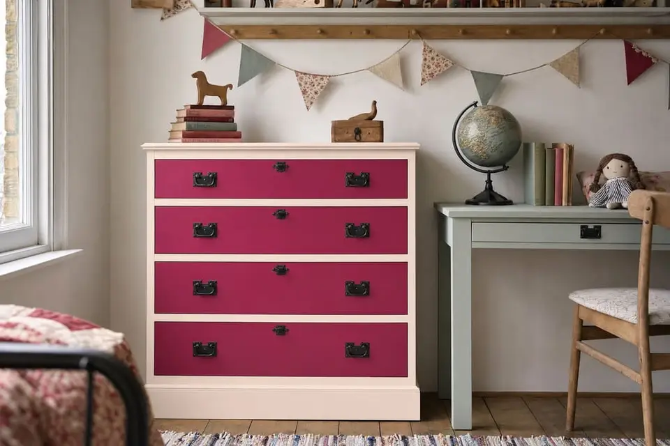
Strawberry milk
Main: Blush · Second: Rocksteady · Third: Vintage Duck Egg
Blush is LRV 85, Rocksteady is LRV 11, and Vintage Duck Egg is LRV 39, so every gap is at least 28 points. Blush and Rocksteady both lean warm, and Vintage Duck Egg leans cool, so the soft green gray calms the pink and the raspberry. Paint the dresser in Blush with the drawer fronts in Rocksteady, and the bookcase or the desk in Vintage Duck Egg.
A dresser and a bookcase or a desk in a child's bedroom.
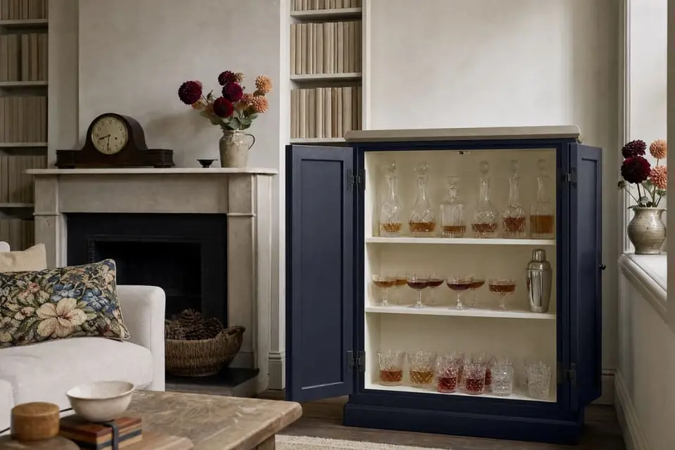
Hotel bar
Main: Inkwell · Second: Kashmir · Third: Grecian Clay
Inkwell is LRV 2, Kashmir is LRV 78, and Grecian Clay is LRV 20, so every gap is at least 18 points. Inkwell leans cool, and Kashmir and Grecian Clay both lean warm with a yellow undertone, so the cream and the gray beige look like a pair and the navy stands apart. Paint the body in Inkwell, the inside in Kashmir, and the top in Grecian Clay.
A bar cabinet in a living room or a dining room.
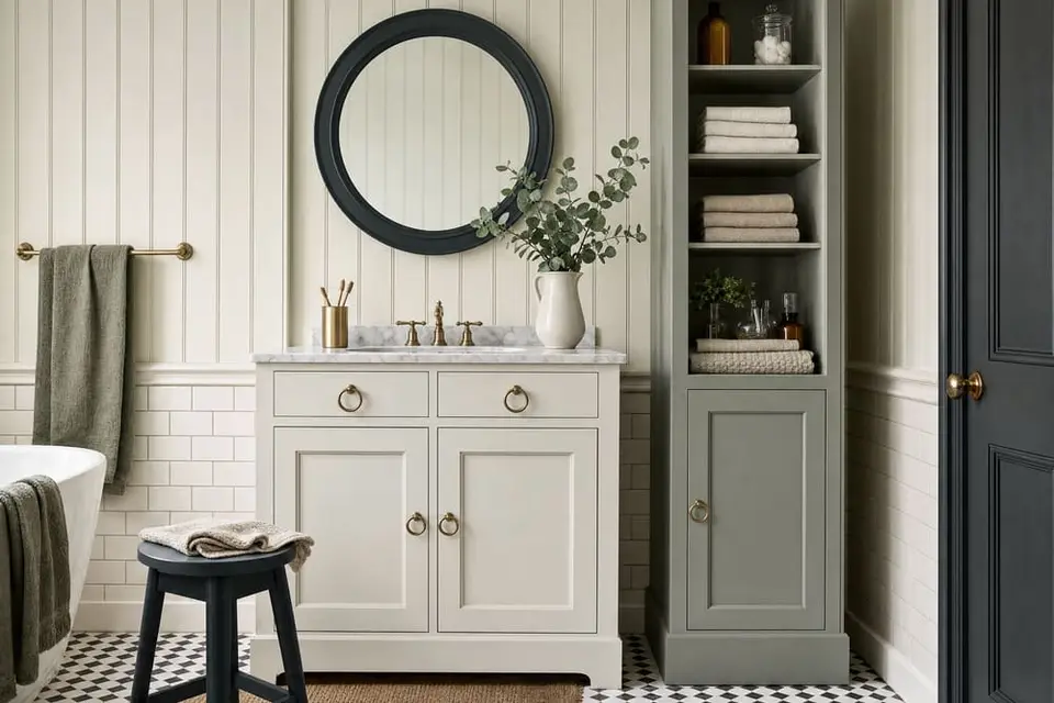
Spa morning
Main: Bone · Second: Celtic Fog · Third: Charleston Green
Bone is LRV 76, Celtic Fog is LRV 36, and Charleston Green is LRV 6, so every gap is at least 30 points. Celtic Fog and Charleston Green both lean cool with a green undertone, and Bone is a neutral, so the three look like one family. Paint the vanity in Bone, the linen cabinet in Celtic Fog, and a stool or a mirror frame in Charleston Green.
A vanity, a linen cabinet, and a stool in a bathroom.
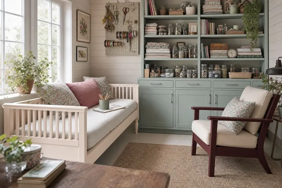
Garden tea
Main: Blush · Second: Vintage Duck Egg · Third: Rosewood
Blush is LRV 85, Vintage Duck Egg is LRV 39, and Rosewood is LRV 5, so every gap is at least 34 points. Blush and Rosewood both lean warm, and Vintage Duck Egg leans cool, so the green gray calms the pink and the deep red and keeps the room from feeling too sweet. Paint the daybed frame in Blush, the bookcase in Vintage Duck Egg, and a chair or the door in Rosewood.
A daybed, a bookcase, and a chair in a she shed.
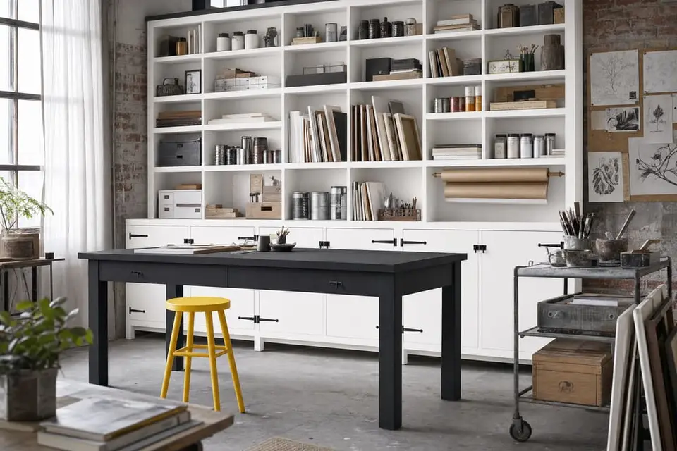
Gallery wall
Main: Snow Owl · Second: Carbon · Third: Soleil
Snow Owl is LRV 92, Carbon is LRV 4, and Soleil is LRV 65, so every gap is at least 27 points. Snow Owl and Carbon are both neutrals, and Soleil leans warm, so the yellow is the only color in the set and the white and the dark gray frame it. Paint the shelving in Snow Owl, the work table in Carbon, and one stool in Soleil.
Shelving, a work table, and a stool in an art studio or a loft.
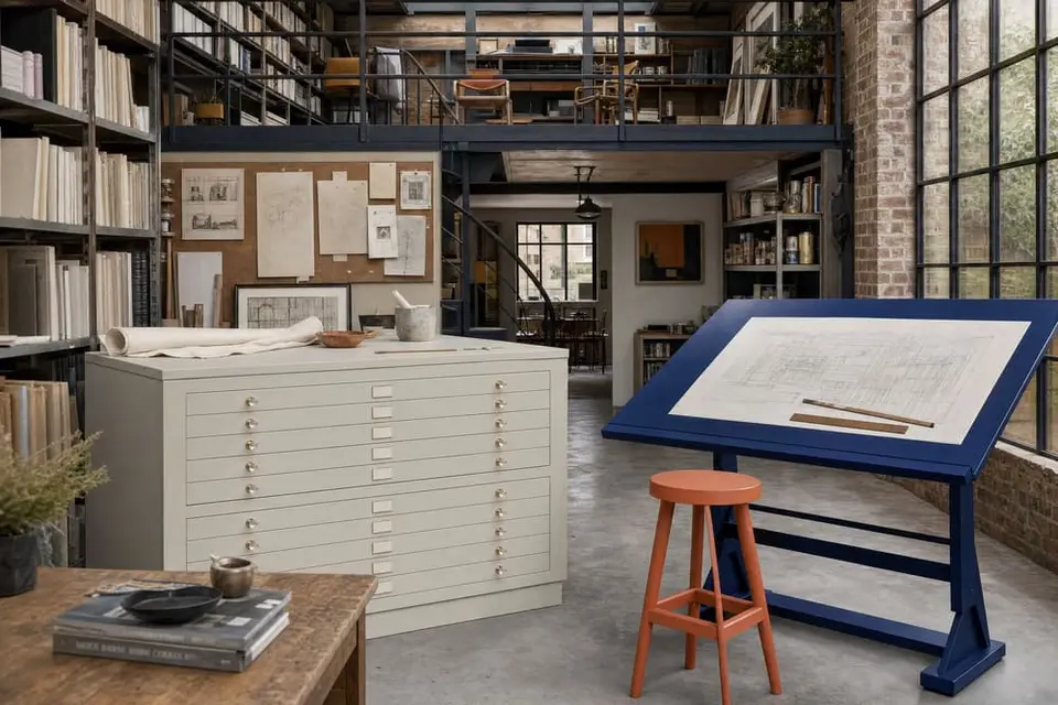
Drafting table
Main: Iconic Gray · Second: Atomic Blue · Third: Terracotta
Iconic Gray is LRV 59, Atomic Blue is LRV 3, and Terracotta is LRV 26, so every gap is at least 23 points. Atomic Blue leans cool and Terracotta leans warm, and Iconic Gray is a neutral that sits between them so the two strong colors don't fight. Paint the flat file in Iconic Gray, the drafting table in Atomic Blue, and a stool or a lamp base in Terracotta.
A flat file, a drafting table, and a stool in an art studio or a home office.
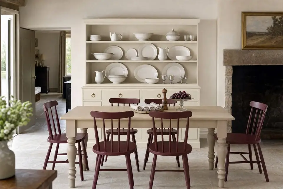
Dinner party
Main: Kashmir · Second: Rosewood · Third: Linen
Kashmir is LRV 78, Rosewood is LRV 5, and Linen is LRV 55, so every gap is at least 23 points. All three lean warm, one yellow, one red, and one beige, so nothing in the set turns cold under the lamps at night. Paint the hutch in Kashmir, the chairs in Rosewood, and the table base in Linen.
A hutch, a set of chairs, and a table in a dining room.
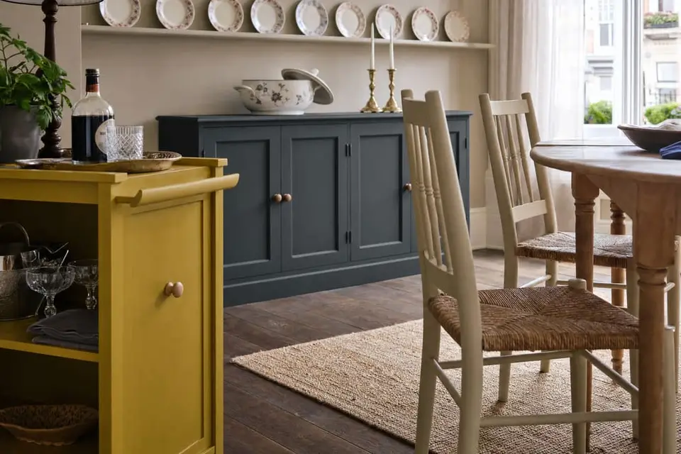
Holiday table
Main: Charleston Green · Second: Linen · Third: Dijon
Charleston Green is LRV 6, Linen is LRV 55, and Dijon is LRV 36, so every gap is at least 19 points. Charleston Green leans cool, and Linen and Dijon both lean warm with a yellow undertone, so the beige and the mustard look like a pair and the deep green stands apart. Paint the sideboard in Charleston Green, the chairs in Linen, and a bar cart or a bench in Dijon.
A sideboard, a set of chairs, and a bar cart in a dining room.
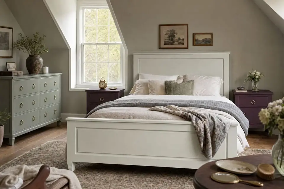
Slow morning
Main: Bone · Second: Celtic Fog · Third: Black Cherry
Bone is LRV 76, Celtic Fog is LRV 36, and Black Cherry is LRV 5, so every gap is at least 31 points. Celtic Fog and Black Cherry both lean cool, and Bone is a neutral, so the three feel like one quiet room. Paint the bed frame in Bone, the dresser in Celtic Fog, and the nightstands in Black Cherry.
A bed frame, a dresser, and a pair of nightstands in a master bedroom.
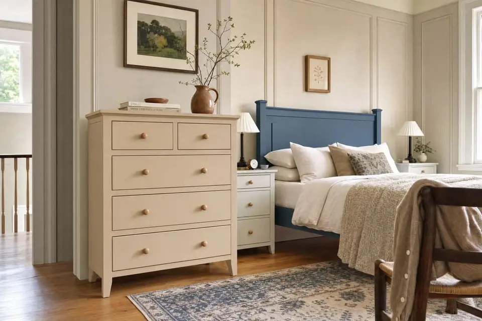
Linen and denim
Main: Linen · Second: Vintage Denim · Third: Bone
Linen is LRV 55, Vintage Denim is LRV 10, and Bone is LRV 76, so every gap is at least 21 points. Linen leans warm and Vintage Denim leans cool, and Bone is a neutral that sits with both, so the beige and the blue don't fight. Paint the dresser in Linen, the headboard in Vintage Denim, and the nightstands in Bone.
A dresser, a headboard, and a pair of nightstands in a master bedroom.
How to build your own
How to put two or three colors together
The steps below show you how to choose colors that look good together on one piece or in one room. By the end you'll be able to pick a main color, add a second and a third that go with it, and know which color goes where.
Step 1: Choose your main color.
The main color is the color that covers the most of what you're painting. On a dresser, that's the body. In a kitchen, that's the cabinets. Choose it for the job the piece does. A piece that gets touched all day hides marks better in a mid or dark color. A piece in a dim corner shows up better in a light color.
Example. You want a kitchen island in Dried Thyme, a soft gray green. The chart lists it at LRV 18. LRV is how light or dark a color is, from 0 (black) to 100 (white). At 18, Dried Thyme is on the dark side. Up close you'll see the green. From across the room it looks like a deep, calm color that hides fingerprints.
Check: the LRV number under your color. Under 20 hides marks best. 20 to 59 shows the color and hides everyday wear. 60 and up brightens a dark spot.
Step 2: Choose a second color at least 15 LRV points away.
The second color goes next to the main color: the drawer fronts, the top, the trim, or the cabinets around an island. Find both colors on the chart. Subtract the smaller LRV from the bigger one. If the answer is 15 or more, the two will look like two colors from across the room. If it's under 15, they'll blur into one.
One more rule. Don't pair two colors that are both under LRV 10. Two very dark colors look like one dark mass from a few steps back, even when they look different up close.
Example. Cream cabinets around the Dried Thyme island. Kashmir is a warm cream at LRV 78. 78 minus 18 is 60, well over 15. You'd see a clearly dark island against clearly light cabinets. A gap of 40 or more looks bold like this. A gap of 15 to 30 looks softer. Sea Salt (LRV 59) beside Higgins Lake (LRV 40) is a gap of 19. You'd see a pale gray green and a soft blue, clearly two colors, but quiet ones.
Check: subtract the two LRV numbers. You want 15 or more, and not both colors under 10.
Step 3: Read the undertone of each color.
Under each color on the chart is its undertone line, like "Warm, slight yellow undertone". The undertone is the faint tint hiding in a color. Two colors with the same undertone (yellow with yellow, green with green) look like they belong together. That's the safe choice. Two colors with opposite undertones (a green with a cream, a blue with a peach) make each other look brighter, and that works when the gap from Step 2 is 15 or more. The one mix to avoid is two grays close in LRV with different undertones.
Example. Dried Thyme reads "Cool, slight green undertone". Kashmir reads "Warm, slight yellow undertone". Those are opposites, and the gap is 60, so it works: the green looks greener and the cream looks creamier. Here is the mix to avoid. Gray Linen (LRV 37, "Warm, slight yellow undertone") next to Celtic Fog (LRV 36, "Cool, slight green undertone") is the same lightness with two different tints. Side by side, Gray Linen looks muddy and Celtic Fog looks cold.
Check: the two undertone lines. The same, or clearly opposite, is good. Close in lightness but different in tint, skip the pair.
Step 4: Check warm against cool.
The first word of the undertone line says warm, cool, or neutral. Warm colors lean toward yellow, red, or brown. Cool colors lean toward blue or green. Neutral colors don't lean either way. Warm with warm feels cozy and settled. Cool with cool feels crisp and clean. Warm next to cool has more contrast, and that's fine as long as you chose it.
Example. Leatherwood (warm, LRV 13) with Natural Light (warm, LRV 61) gives you a brown and a soft yellow that feel like one cozy room. Sea Salt (cool, LRV 59) with Vintage Denim (cool, LRV 10) gives you a gray green and a denim blue that feel like a beach house. Kashmir (warm, LRV 78) with Inkwell (cool, LRV 2) gives you cream against near black, the sharpest look of the three.
Check: the first word of each undertone line. Two warms or two cools feel calm. One of each feels sharper.
Step 5: If the two colors fight, put a neutral between them.
Sometimes two colors you love don't look right side by side. Add a neutral. A neutral is a white, gray, or black with no undertone, so it doesn't lean warm or cool. The chart has 12: Antique Villa, Snow Owl, Bone, Limestone, Iconic Gray, Smokey Quartz, Peppercorn, Weathervane, Graphic Slate, Carbon, Wrought Iron, and Jet Black. The five go-with-everything colors do the same job. Gray Linen (LRV 37) is a warm gray beige, but it takes warm and cool accents equally, so it works as a bridge too.
Example. You want Terracotta (LRV 26, a warm orange) and Higgins Lake (LRV 40, a cool blue) in the same room. The gap is 14, under 15, and it's warm against cool. Put Antique Villa (neutral, LRV 94) between them: a Terracotta hutch, Antique Villa cabinets, a Higgins Lake island. You'd see orange, white, blue. Each color now sits next to white instead of next to the other, so they stop fighting.
Check: the undertone line of your bridge color. It should say "Neutral, no undertone".
Step 6: Add a third color and split them 60/30/10.
Three colors used together are a trio. Check the third color against each of the other two the same way: 15 or more LRV points from both. Then give each color a share of the piece. Paint companies like Behr use a 60/30/10 split: the main color covers about 60 percent of what you see, the second about 30, the third about 10. On a dresser: body 60, drawer fronts 30, the top or the inside 10. In a room: the biggest piece is the main, the next biggest is the second, a stool or a frame is the third. You don't need to measure. If the main color covers more than half of what you see and the third covers the least, you're close enough.
Example. A dining hutch in the Low tide trio. Sea Salt (LRV 59) on the body is the 60. Prussian Blue (LRV 8) on the back panel is the 30. Bone (LRV 76) on the trim and shelf edges is the 10. The gaps are 51, 17, and 68, all over 15. You'd see a pale gray green hutch with a deep blue back wall behind the shelves and light trim.
Check: which color covers the most. That one is your 60. The color that covers the least is your 10.
A kitchen, built with the steps
Step 1, the main color. You're painting a kitchen: cabinets, an island, and two stools. The cabinets cover the most, so they're the main color. You want them cream. Kashmir is LRV 78, "Warm, slight yellow undertone".
Step 2, the second color. For the island you like Dried Thyme, LRV 18. 78 minus 18 is 60. That's over 15, so the island will stand out from the cabinets, and neither color is under LRV 10.
Steps 3, 4, and 5. Kashmir is warm with a yellow undertone. Dried Thyme is cool with a green undertone. Opposites with a big gap, so the cream looks creamier and the green greener. You're choosing warm against cool on purpose. The two aren't fighting, so you don't need a bridge yet.
Step 6, the third color. The stools. Leatherwood (LRV 13) is only 5 points from the island, so from across the room the stools would blur into it. Grecian Clay (LRV 20) is 2 points away, same problem. Gray Linen (LRV 37) is 19 from the island and 41 from the cabinets. It's the gray beige from Step 5, so it also ties the cream to the green. Split: cabinets 60, island 30, stools 10.
What you'd see. Cream cabinets, a deep green island, and gray beige stools that tie the two together.
Cabinets, 60
Kashmir, LRV 78Island, 30
Dried Thyme, LRV 18Stools, 10
Gray Linen, LRV 37
Before you buy: test with 2 oz samples, in the room
Brush each sample on a scrap of wood or on the back of the piece. Two coats. Let it dry. Set the samples in the room where the piece will live and look at them side by side in daylight. Look again at night under the lamps you use. Colors change between the two, and a warm white can turn yellow under a lamp. If you still like them together both times, buy the full size.
Choose the finish last
The topcoat changes how the color looks. Whitewash Glaze makes a piece look weathered, like a beach house. Black Walnut Glaze makes it look older. Black Furniture Wax settles into carved details so they stand out. Clear wax or Varnish leaves the color exactly as painted.
How much paint
Coverage by size, and the size to buy
The coverage figures are below. Measure your piece, pick your coats, and read across. Whites, red, and black need the most coats, so for those colors read the 3 coat column.
| Size | Covers |
|---|---|
| 2 oz sampleEnough to test the color on your piece | a test patch |
| Pint (16 oz)One coat on a piece up to 80 sq ft | 80 sq ft |
| Quart (32 oz)One coat on a piece up to 160 sq ft | 160 sq ft |
| GallonOne coat on a run of cabinets | 640 sq ft |
Measure a case piece
Measure width, height, and depth in inches. If you're painting the front, back, two sides, and top:
sq ft = (2 × (W × H + D × H) + W × D) ÷ 144
Example. A dresser 36 in wide, 32 in high, 18 in deep:
2 × (36 × 32 + 18 × 32) + 36 × 18 = 4104 sq in = 28.5 sq ft.
Two coats: 57 sq ft, so 1 pint. Three coats: 86 sq ft, so 1 quart.
Add the drawer fronts and the insides of doors if you're painting them. Bare or porous wood drinks more paint than a finished surface. The coverage figures are approximate.
| Sq ft | 1 coat | 2 coats | 3 coats |
|---|---|---|---|
| 15 | 1 pint | 1 pint | 1 pint |
| 20 | 1 pint | 1 pint | 1 pint |
| 30 | 1 pint | 1 pint | 1 quart |
| 40 | 1 pint | 1 pint | 1 quart |
| 60 | 1 pint | 1 quart | 1 quart + 1 pint |
| 80 | 1 pint | 1 quart | 1 quart + 1 pint |
| 120 | 1 quart | 1 quart + 1 pint | 2 quarts + 1 pint |
| 160 | 1 quart | 2 quarts | 3 quarts |
| 240 | 1 quart + 1 pint | 3 quarts | 1 gallon + 1 pint |
| 320 | 2 quarts | 1 gallon | 1 gallon + 2 quarts |
How the table works: square feet times coats, divided by 80 sq ft per pint, rounded up, then written as the smallest mix of gallons (8 pints), quarts (2 pints), and pints.
Colors that need the most coats
Whites, red, and black need the most coats because of their pigments, so plan on more paint for them. On this chart that means the 7 whites plus Limestone, and Perfect Red, Republic Red, and Jet Black. Buy the 3 coat amount for those.
Prep and primer
When you can skip the primer, and when you can't
Most furniture needs no sanding and no primer before this paint. Cabinets, tile, and floors do, every time. So does bleed-through: tannins in some woods seep up through the paint and stain it.
Woods and pieces that bleed
Mahogany, knotty pine, and cherry are the woods known for bleeding. Any white piece from the Depression era will bleed too, and has to be primed. Light paint shows the stains most.
How to block it
Stain Eliminating Primer. A bonding primer that blocks stains, odors, and tannins. Use it under white or light colors to stop tannin bleed. One quart covers about 160 sq ft. Dry to the touch in 1 hour, recoat in 4 to 6. Some stains need two coats, a stubborn piece a third. On a piece you know will bleed, allow 6 hours between coats. Wait 24 hours after painting before the topcoat.
Shellac. If a stain shows after you paint, brush shellac over it as a barrier, then paint over the shellac.
Pieces that are always primed
Cabinets, tile, and floors are always primed, whatever the color. So is anything you'll finish with One Hour Enamel.
Laminate
Laminate furniture can be primed for a stronger grip, but it usually doesn't need it.
The short version
Cabinets, tile, floors, and anything getting One Hour Enamel: prime, whatever the color. Dark paint on clean, sealed furniture: wash it and paint. Light paint on mahogany, knotty pine, cherry, an old red-stained piece, or a Depression era white piece: White primer first. Not sure of the wood: paint a test patch, let it dry overnight, and look for a stain. If one shows, prime.
Which primer shade under which paint
The right column says which chart colors each rule covers, by the LRV printed on the chart. Wise Owl also sells a Coffee Bean shade. Its page gives no rule for it, so it isn't in this table.
- White primer
- Under whites and light colors.
- LRV 60 and up (lightness 1 to 11)
- Gray primer
- Under medium colors like yellows and reds.
- LRV 20 to 59 (lightness 12 to 32). Its yellows and reds are Dijon, Chartreuse, and Terracotta
- Clear primer
- Under dark colors, or when you plan to distress. Looks milky in the can and dries clear.
- LRV under 20 (lightness 33 to 73), or any color you plan to sand back to bare wood in spots
- Dark Gray primer
- Under very dark tones.
- LRV 4 and below (lightness 60 to 73)
The method
Clean, paint, seal
Most furniture doesn't need sanding or primer before this paint. Cabinets, tile, and floors always get primer first. Wash the piece, brush on thin coats and let each one dry, then seal the paint with a topcoat.
Clean
Wash the piece with a household cleaner that has no oil in it. Vinegar and water works too. Old furniture polish and wax stop paint from sticking, so wash them off. That's all the prep most furniture needs. Cabinets, tile, and floors get Stain Eliminating Primer after the wash.
Paint
Shake the paint, then stir it. Brush on one thin coat and let it dry all the way. If you paint over a coat that's still drying, it can lift. Add a second coat if you want fuller color. Whites, red, and black need the most coats.
Seal
A topcoat is a clear coat that goes over the paint to protect it. The dried paint is porous, so every piece needs one. Pick it by how hard the piece will be used. The table below says which topcoat fits which piece. If you sand the dried paint, it looks lighter for a while. The color comes back when the topcoat goes on.
The method on one dresser
Say it's the dresser above: 36 in wide, 32 in high, 18 in deep, about 28.5 sq ft, going Higgins Lake (LRV 40).
Clean. Wash it with a household cleaner that has no oil in it. It's a dresser, not a cabinet, and it isn't mahogany, knotty pine, or cherry, so it needs no primer. Higgins Lake isn't a white, so bleed isn't a worry either.
Paint. Shake and stir a pint. One thin coat, dry all the way, then a second. Two coats on 28.5 sq ft is 57 sq ft, inside a pint's 80, so 1 pint does it.
Seal. A dresser is an everyday piece, so the table below says Furniture Wax. Brush it on, wait about 20 minutes, and wipe off the excess. Clear wax leaves the color exactly as painted.
Topcoats
Which topcoat for which piece
Pick the finish by how hard the piece will be used, then read across.
- Kitchen cabinets, dining tables, and anything that gets heavy use
- Varnish, Matte or Satin
- It's rated industrial grade for cabinets and pieces that get heavy use. It's water based and dries clear, and it has no amber resins, so it can't yellow. Brush on thin, even coats and let each one dry all the way. Matte keeps the flat look of the paint. Prime cabinets first.
- Tabletops, doors, and trim
- One Hour Enamel Clear, Matte, Satin, or Semi Gloss
- It levels itself as it dries, so brush marks disappear. It doesn't yellow. It's 90 percent cured 4 hours after it dries, so you can use the piece the next day, and fully cured in 14 days. Nothing goes over it, so it's the last coat. Prime the piece first.
- Dressers and everyday pieces
- Furniture Wax, Clear, Black, or Black Walnut
- It's all natural, with no added solvents. Brush it on, wait about 20 minutes, and wipe off the excess. Clear doesn't change the color. Black and Black Walnut settle into carved details. Wax goes on last, because nothing sticks over it.
- A soft, hand rubbed sheen, or a piece that's part paint and part bare wood
- Furniture Salve
- It's a balm of hemp oil and beeswax. It seals the paint and brings back bare wood and leather at the same time. Rub in a thin layer, wait a minute, and buff off the excess with a lint-free cloth. It comes in 19 scents, including Unscented Hemp. Hemp oil can tint whites, so skip it on a white piece.
- Outdoor furniture
- Varnish, three thin coats
- Three thin coats are enough to protect a piece that lives outside.
- An antiqued look
- Glaze, over one coat of Varnish or One Hour Enamel Clear
- Glaze is a tinted finish you brush on and wipe most of the way back off, so the color stays in the carved details and the piece looks older. Seal the paint first. Glaze one section at a time, wipe it back with a damp, lint-free cloth, and let it dry 2 hours. For full protection, add one more coat of Varnish or Enamel Clear over it. Black Walnut makes a piece look older. Whitewash makes it look weathered. Gold, Silver, Copper, and Rose Gold add shine.
- Any white piece
- Varnish or clear Furniture Wax
- Neither one yellows. Furniture Salve is made with hemp oil, which can tint whites, so skip it on a white piece.
Cabinets, tile, and floors are always primed before the paint goes on. So are woods that bleed, every white piece, and anything that will get One Hour Enamel.
The Free PDF
Keep a copy of the guide
The PDF has the full color chart, the pairings, the method, and the topcoat picks. You can save it, print it, and take it to the hardware store. Every color in this guide is available in our store.
Where to buy
Pick your color, pick your size
The hex values, LRV, undertone, lightness rank, and every other number in this guide are our own estimates, worked out from Wise Owl's published color chips. This is an unofficial guide. The opinions in it are ours and are not endorsed by Wise Owl Paint. Every color in it belongs to Wise Owl. For advice about a specific Wise Owl product, contact Wise Owl. How the numbers were worked out: LRV is the chip's CIE Y (the standard measure of how much light a color reflects) under D65 daylight, times 100. Warm, cool, neutral, and the undertone come from the chip's chroma (how strong its color is) and hue angle (which color it leans toward) in the CIELAB and LCH color models, with sRGB inputs as defined in W3C CSS Color 4: chroma under 5 is neutral, 5 to 15 prints "slight", and a hue of 350 through 125 degrees is warm, the rest cool. They are not Wise Owl's specifications. For exact values, contact Wise Owl. Wise Owl and Chalk Synthesis Paint are trademarks of Wise Owl Paint. Stellar Luxe is an independent retailer.